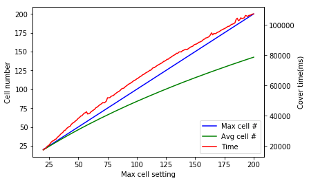
python在一张图中使用两组y坐标

少说闲话直接上代码:

1
2
3
4
5
6
7
8
9
10
11
12
13
14
15
16
17
18
19
20
21
22
23
24
25
26
27
28
29
30
31
32
33
34
35
36
37
38
39
import pandas as pd
import matplotlib.pyplot as plt
csv_file = file_path_name
df = pd.read_csv(csv_file,header=None)
df.columns = [['max cell','avg cell','time']]
df['index'] = range(len(df))
fig, ax0 = plt.subplots()
ax1 = ax0.twinx()

df.plot(x=['index'], # 设置 x 轴值域
y=['max cell','avg cell'], # 设置 y 轴值域
ax=ax0, # 指定在哪套 y 坐标画
color=['b','g'], # 指定颜色
)
df.plot(x=['index'],
y=['time'],
ax=ax1,
style='r--' # 指定 style
)

# ------------ 下面的操作将两个图的 legend 整合成一个 -------------
# 提取出图中的 lines 和 labels
lines0, labels0 = ax0.get_legend_handles_labels()
lines1, labels1 = ax1.get_legend_handles_labels()

# 删除 ax0 上的 legend
ax0.legend_.remove()

# 重命名 legend,并添加整合以后的 legend 到图中
labels = ["Max cell #", "Avg cell #", "Time"]
ax1.legend(lines0 + lines1, # 整合所有的 line
labels, # 设置新的 labels
loc=4, # 设置 legend 的位置,1 从右上角开始,逆时针算位置
)

# 设置图表的两套 y 轴标题和公用的 x 轴标题
ax0.set_xlabel("Max cell setting")
ax0.set_ylabel("Cell number")
ax1.set_ylabel("Cover time(ms)")

loc 位置参考如下:

Location String Location Code
‘best’ 0
‘upper right’ 1
‘upper left’ 2
‘lower left’ 3
‘lower right’ 4
‘right’ 5
‘center left’ 6
‘center right’ 7
‘lower center’ 8
‘upper center’ 9
‘center’ 10
0%